


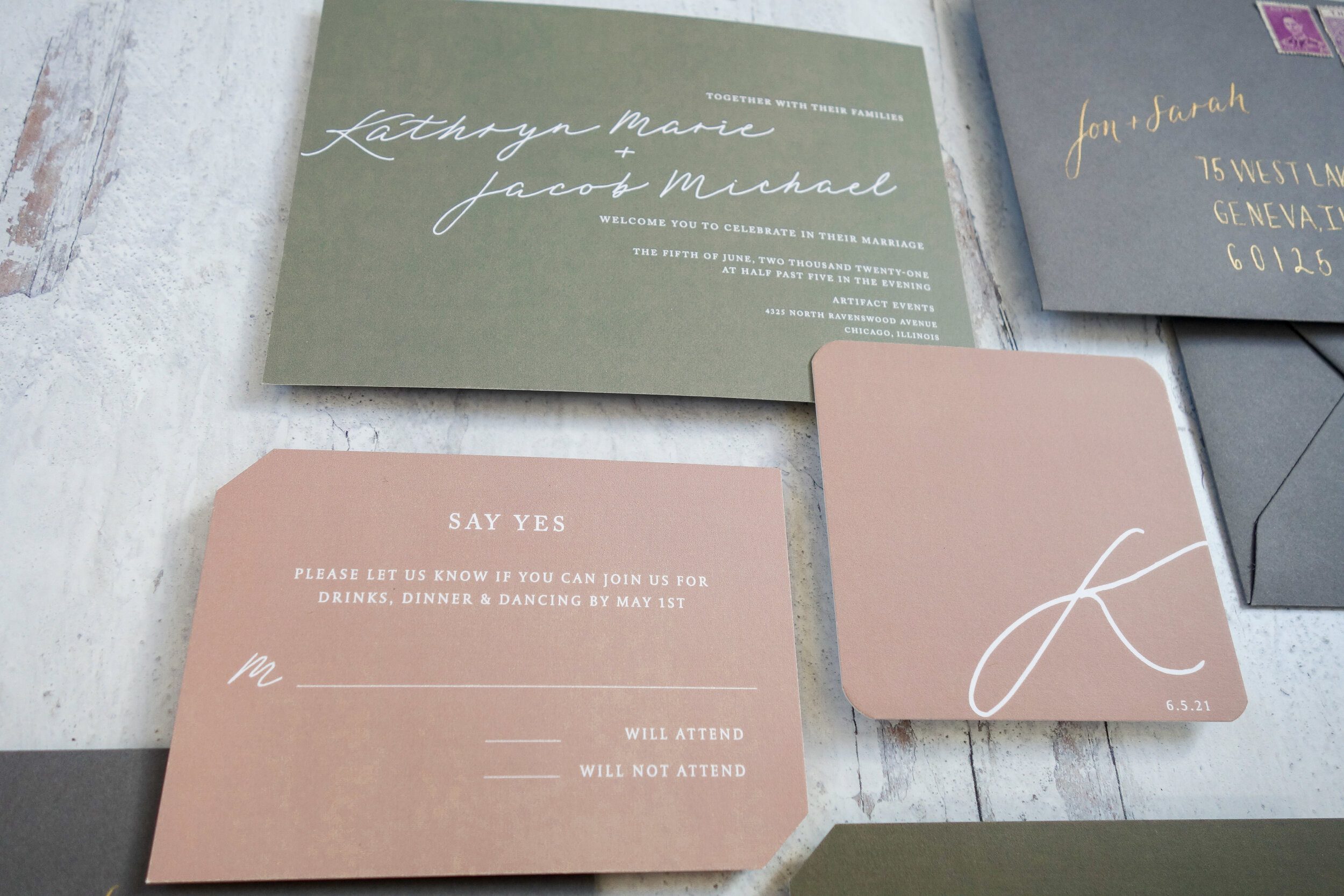
Blush, soft green, and moss green gave this invitation design a fresh palette. Soft gray envelopes and gold calligraphy added another layer without overwhelming the color.
A palette with variation
The mix of softer and deeper greens gave the suite more range than a single accent color. Blush warmed the combination while gray envelopes kept the outer layer quiet.
A mark built from initials
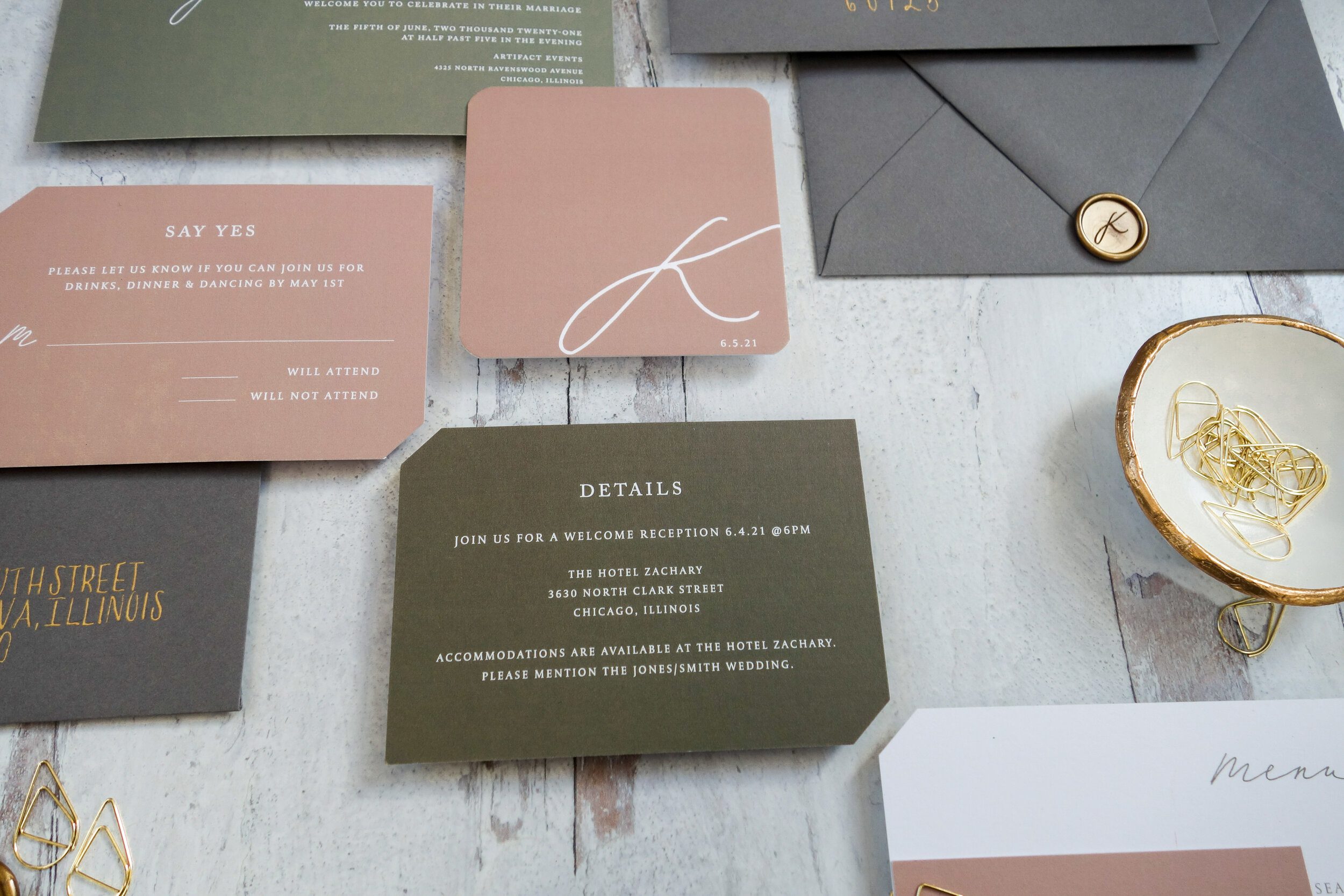
The couple’s first initials were combined into a hand-drawn modern monogram. It appeared on simple wax seals and custom coasters, connecting the invitation with a reception detail.
Two lettering styles
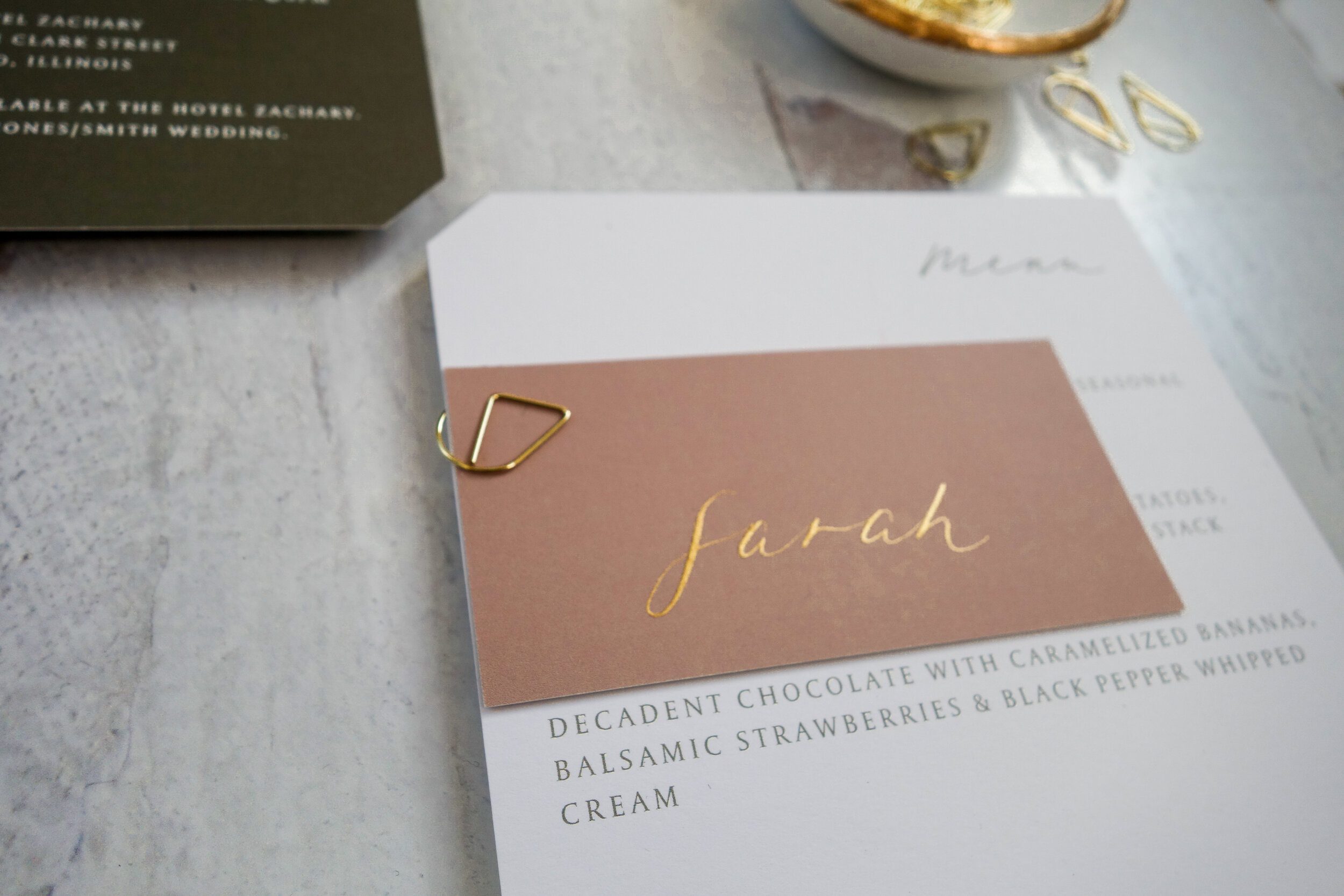
The envelope paired modern script with handwritten monoline lettering. The contrast created hierarchy while keeping the addressing part of the design.
A personal starting point
This is a past design example, not a current suite listing. For a new project, begin with the colors and lettering you love, then decide where a monogram will add the most.
Explore your stationery options with Lively House.
