


Persimmon, blush, and burnt orange brought warmth to this styled wedding design at The Haight. Modern calligraphy connected the invitation, envelope, and reception menu.
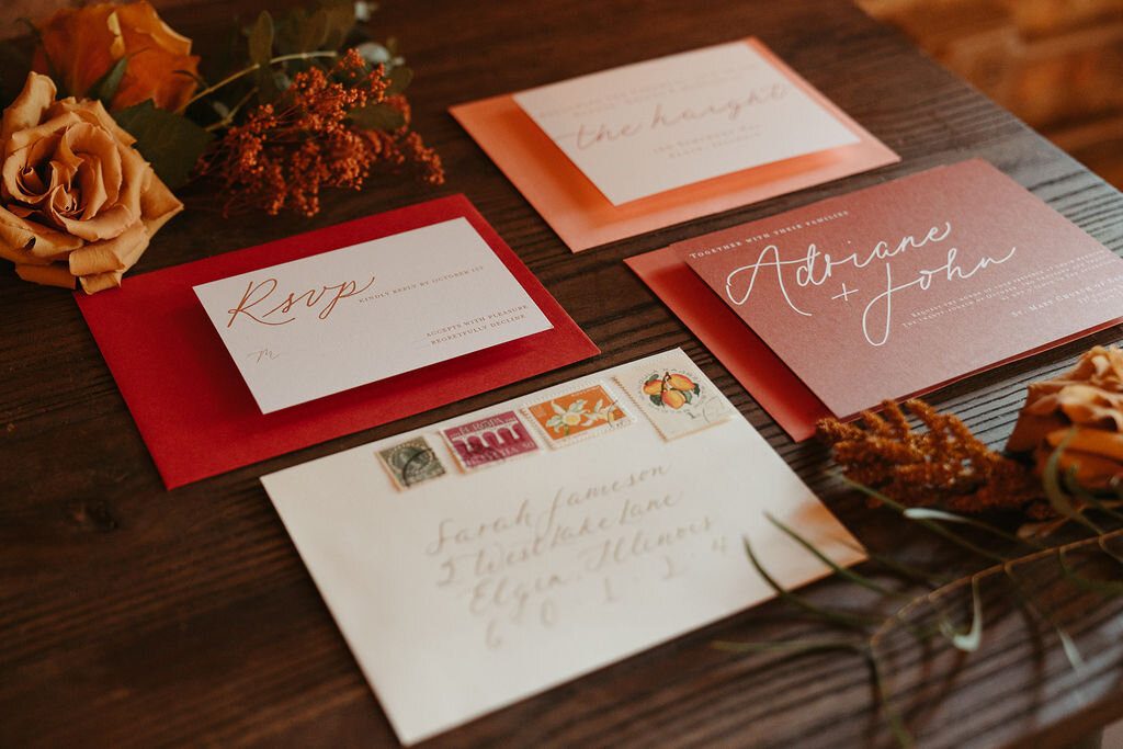
Warm color with a modern rhythm
The palette gave the suite an autumnal character without relying on a literal seasonal motif. The contrast between persimmon and softer blush kept the design warm and layered.
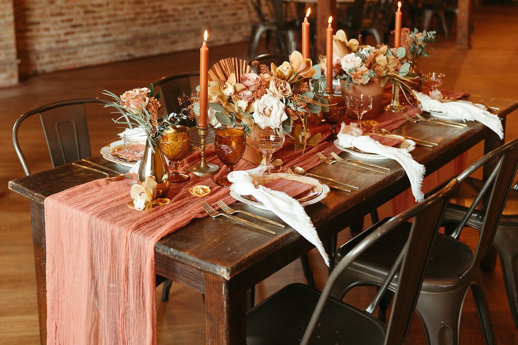
An envelope with personality
The envelope focused on modern script and a collection of vintage postage. Those outside details introduced the palette and lettering before the invitation was opened.
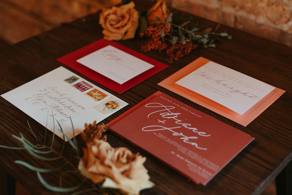
Carry the color to the table
A persimmon menu continued the stationery story in the tablescape. Repeating one strong color can connect the reception to the invitation while leaving room for flowers, linens, and the venue to contribute their own texture.
Styled shoot credits
Models: @jordanwahl. Styling and planning: @chicfromchicago. Florals: @stemmingfromlove. Hair: @emilyraebridalhair. Makeup: @elizabethscottcompany. Venue: @thehaight. Cake: @tonipatisseriecafe. Dresses: @simplyluxe. Photography: @anissadphotography and @everly.collective. Rentals: @thefestivefrog. Jewelry: @hautecarat.
Original project credits and links
Original project links: @jordanwahl · @chicfromchicago · @stemmingfromlove · @emilyraebridalhair · @elizabethscottcompany · @thehaight · @tonipatisseriecafe · @simplyluxe · @anissadphotography · @everly.collective · @thefestivefrog · @hautecarat
Explore your stationery options with Lively House.
