


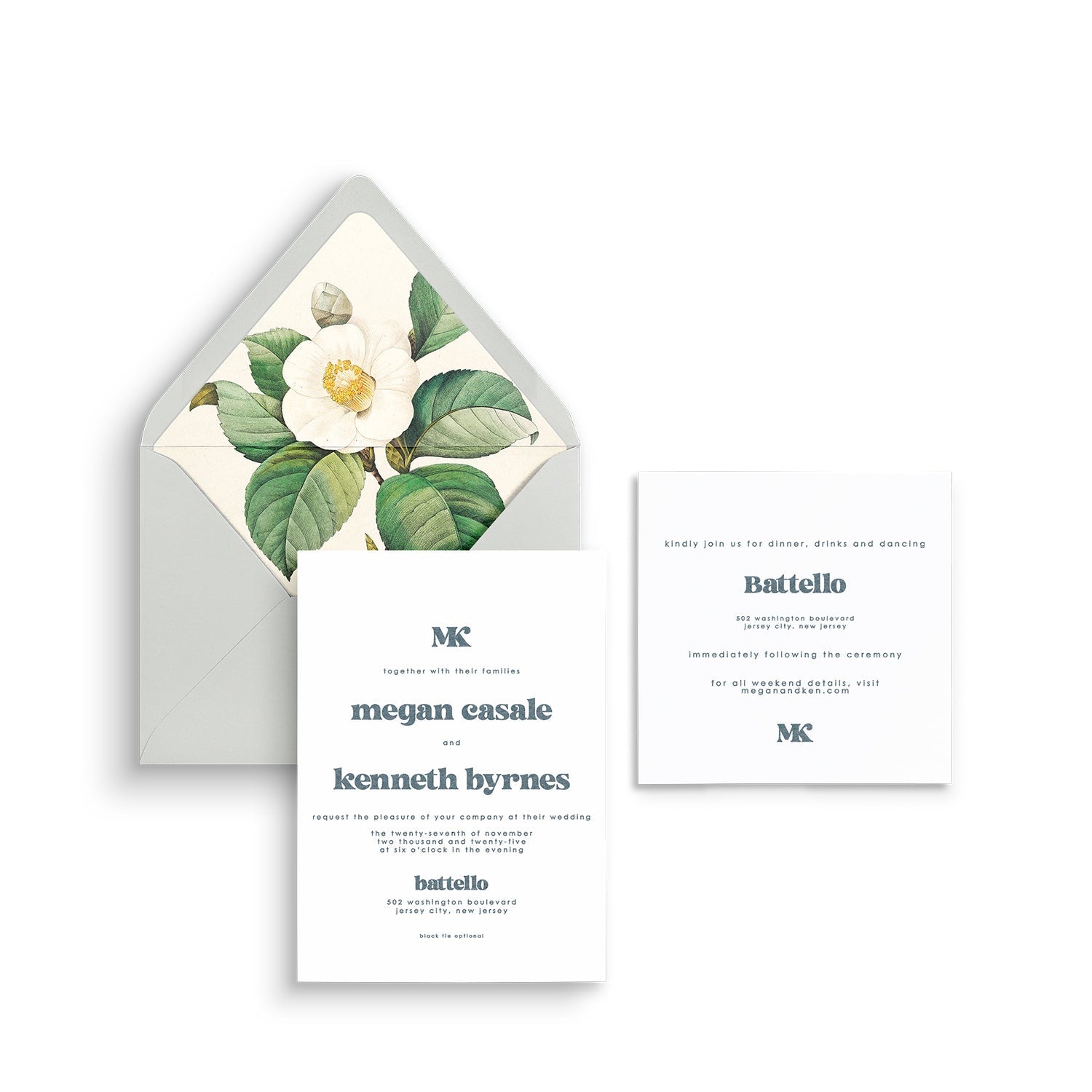
The Simple Modern suite centers on bold sans-serif typography and a clean layout. Its restrained structure gives wording, color, and the paper room to shape the final impression.
Start with the typography
A strong type hierarchy helps the names, date, and location feel clear. The design suits couples who enjoy a modern visual rhythm without elaborate ornament.
Use color deliberately
White and soft gray can keep the palette quiet, while terracotta, sage, or citrus accents can introduce more energy. Review the current paper, ink, and liner choices rather than relying on a screen color alone.
Carry the simplicity to the reception
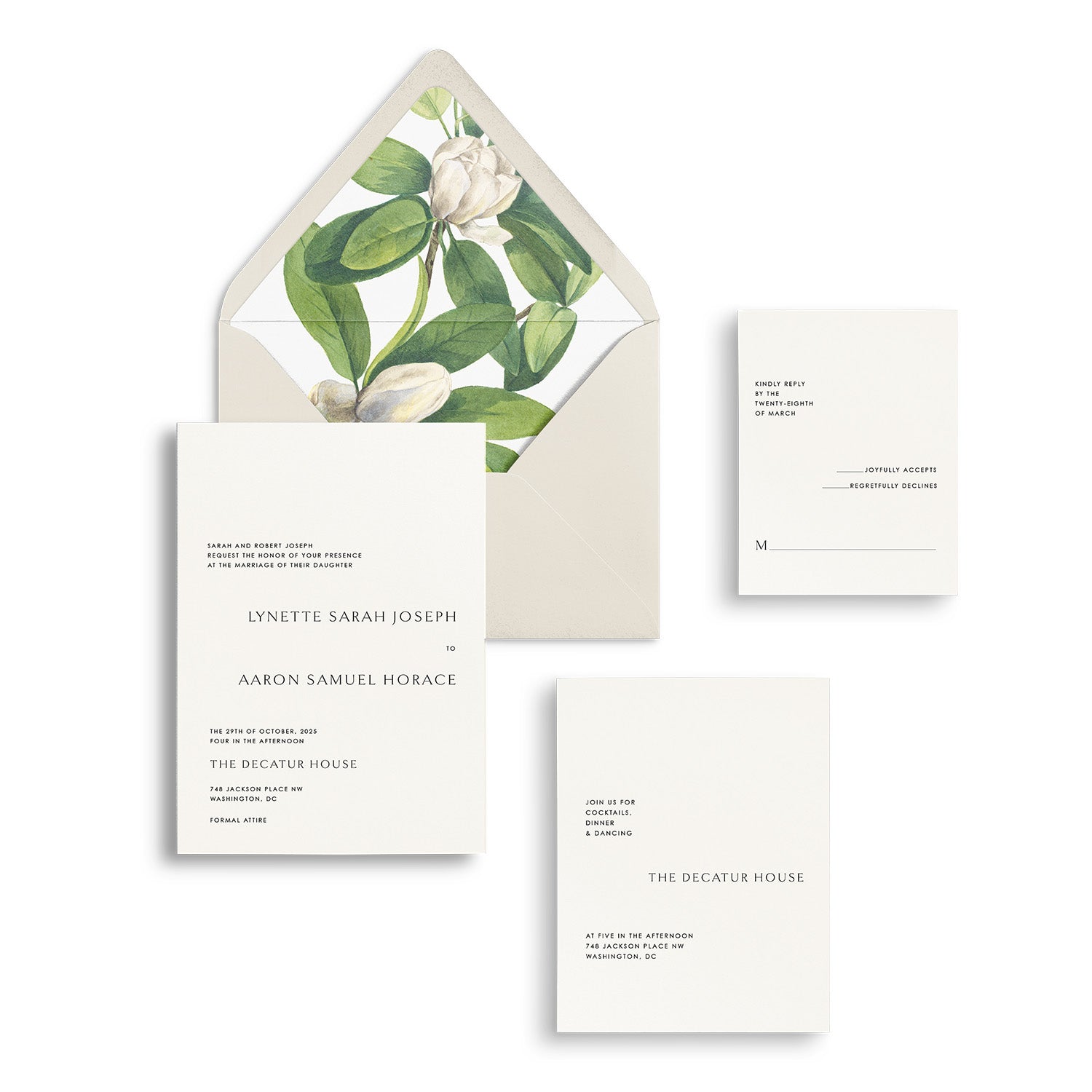
Modern signage and minimal place cards can continue the same visual direction. Repeat the type pairing or a selected color, allowing flowers and other materials to provide texture.
Confirm the available choices
An established suite gives the project a clear starting point. Ask which wording, paper, ink, print, and finishing selections are available for the current design, and confirm the proofing and production schedule.
Explore the collection
View the Ready-to-Wed invitation collection and discuss Simple Modern with Lively House before ordering.
Explore your stationery options with Lively House.
